

Navigation
Configure your documentation site navigation with groups, pages, dropdowns, tabs, and anchors in docs.json to build a sidebar structure.
The navigation property in docs.json controls the structure and information hierarchy of your documentation.
With proper navigation configuration, you can organize your content so that users can find exactly what they're looking for.
Choose one primary organizational pattern at the root level of your navigation. Once you've chosen your primary pattern, you can nest other navigation elements within it.
Choose a primary pattern
Section titled “Choose a primary pattern”Use the pattern that matches how you want visitors to move between top-level sections of your content.
| Pattern | Use when | Example |
|---|---|---|
| Groups | Your content fits in one linear sidebar and you don't need a second axis of navigation. | A single-product SDK reference. |
| Tabs | You have parallel sections that share the same audience. | Guides, API reference, and SDKs tabs for one product. |
| Anchors | You want persistent links to a small number of top-level destinations (external or internal) visible at all times. | Community, status page, or another link alongside your product documentation. |
| Dropdowns | Similar to tabs, but you want to use a dropdown menu for navigation. | Switching between product documentation, API reference, and partner integrations. |
| Products | You maintain documentation for multiple distinct products under one project, and each product has its own full site. | A platform with separate content for Payments, Identity, and Analytics. |
| Versions | You publish multiple versions of the same content in parallel. | Maintaining v1 and v2 API docs simultaneously. |
| Languages | You publish translated versions of the same content. | English, Spanish, and Japanese documentation for one product. |
Pages are the most fundamental navigation component. Each page is an MDX file in your documentation repository.
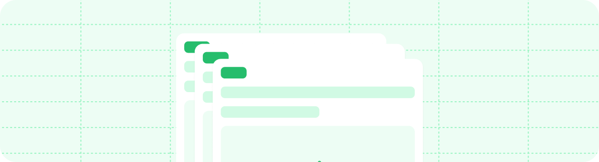
In the navigation object, pages is an array. Each entry must reference the path to a page file.
{
  "navigation": {
    "pages": [
      "settings",
      "pages",
      "navigation",
      "themes",
      "custom-domain"
    ]
  }
}
Groups
Section titled “Groups”Use groups to organize your sidebar navigation into sections. You can nest groups within each other, label them with tags, and style them with icons.
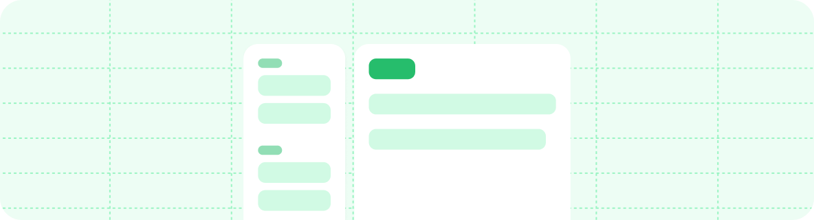
In the navigation object, groups is an array. Each entry is an object that requires a group field and a pages field. The icon, tag, root, and expanded fields are optional.
{
  "navigation": {
    "groups": [
      {
        "group": "Getting started",
        "icon": "play",
        "pages": [
          "quickstart",
          {
            "group": "Editing",
            "expanded": false,
            "icon": "pencil",
            "pages": [
              "installation",
              "editor"
            ]
          }
        ]
      },
      {
        "group": "Writing content",
        "icon": "notebook-text",
        "tag": "NEW",
        "pages": [
          "writing-content/page",
          "writing-content/text"
        ]
      }
    ]
  }
}
Root page
Section titled “Root page”Use the root property to designate a main page for a group. When a group has a root page, clicking the group title in the sidebar navigation opens the root page. Root pages work for top-level and nested groups.
{
  "navigation": {
    "groups": [
      {
        "group": "API pages",
        "root": "api-overview",
        "pages": [
          "api-reference/get",
          "api-reference/post",
          "api-reference/delete"
        ]
      }
    ]
  }
}
Directory listings
Section titled “Directory listings”Use the directory property to automatically render a directory of child pages and groups on group root pages. Set directory on any object within the navigation tree in docs.json. Groups with a root page matching or beneath that object display a listing of their pages and groups below their page contents.
The directory property accepts three values:
| Value | Behavior |
|---|---|
"none" |
No directory listing. Default value. |
"accordion" |
Displays child pages in a collapsible list grouped by section. |
"card" |
Displays child pages in a horizontal card layout. |
The directory value inherits recursively through the navigation tree. Set it anywhere within the navigation object and all descendant groups inherit the same value. Any descendant can override the inherited value by setting directory to a different value.
You can set directory anywhere in the navigation object in your docs.json file, including on tabs, anchors, dropdowns, products, versions, languages, and individual groups.
{
  "navigation": {
    "groups": [
      {
        "group": "Help Center",
        "root": "help/index",
        "directory": "accordion",
        "pages": [
          {
            "group": "Getting Started",
            "root": "help/getting-started/index",
            "pages": [
              "help/getting-started/quickstart",
              "help/getting-started/install"
            ]
          },
          {
            "group": "API Reference",
            "root": "help/api/index",
            "directory": "none",
            "pages": [
              "help/api/overview",
              "help/api/endpoints"
            ]
          }
        ]
      }
    ]
  }
}
In this example:
- Help Center uses
"accordion"and its root page displays a directory listing. - Getting Started inherits
"accordion"from its parent and also displays a directory listing. - API Reference overrides with
"none", so its root page does not display a directory listing.
Default expanded state
Section titled “Default expanded state”Use the expanded property to control the default state of a nested group in the navigation sidebar.
expanded: true: Expands the group by default.expanded: falseor omitted: Collapses the group by default.
{
  "group": "Getting started",
  "pages": [
    "quickstart",
    {
      "group": "Advanced",
      "expanded": false,
      "pages": ["installation", "configuration"]
    }
  ]
}
Tabs create distinct sections of your documentation with separate URL paths. Tabs create a horizontal navigation bar at the top of your documentation that lets users switch between sections.
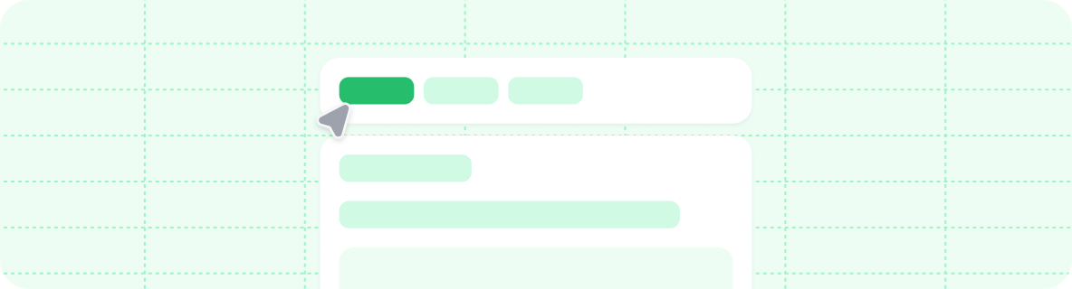
In the navigation object, tabs is an array. Each entry is an object that requires a tab field and can contain other navigation fields, such as groups, pages, icons, or links to external pages.
{
  "navigation": {
    "tabs": [
      {
        "tab": "API reference",
        "icon": "square-terminal",
        "pages": [
          "api-reference/get",
          "api-reference/post",
          "api-reference/delete"
        ]
      },
      {
        "tab": "SDKs",
        "icon": "code",
        "pages": [
          "sdk/fetch",
          "sdk/create",
          "sdk/delete"
        ]
      },
      {
        "tab": "Blog",
        "icon": "newspaper",
        "href": "https://external-link.com/blog"
      }
    ]
  }
}
Menus add dropdown navigation items to a tab. Use menus to help users go directly to specific pages within a tab.
In the navigation object, menu is an array. Each entry is an object that requires an item field and can contain other navigation fields, such as groups, pages, icons, or links to external pages.
A menu item can hold pages, an external link via href, or any navigation division (groups, tabs, anchors, dropdowns, products, languages, or versions). Use a division inside a menu item when you want that column to render the same kind of nested navigation that the division provides at the top level.
{
  "navigation": {
    "tabs": [
      {
        "tab": "Developer tools",
        "icon": "square-terminal",
        "menu": [
          {
            "item": "API reference",
            "icon": "rocket",
            "groups": [
              {
                "group": "Core endpoints",
                "icon": "square-terminal",
                "pages": [
                  "api-reference/get",
                  "api-reference/post",
                  "api-reference/delete"
                ]
              }
            ]
          },
          {
            "item": "SDKs",
            "icon": "code",
            "description": "SDKs are used to interact with the API.",
            "pages": [
              "sdk/fetch",
              "sdk/create",
              "sdk/delete"
            ]
          }
        ]
      }
    ]
  }
}
Anchors
Section titled “Anchors”Anchors add persistent navigation items to the top of your sidebar. Use anchors to section your content, provide quick access to external resources, or create prominent calls to action.
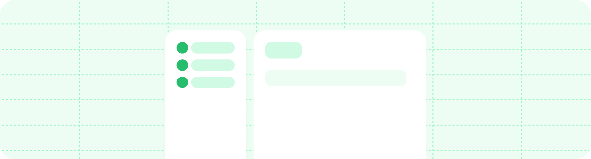
In the navigation object, anchors is an array. Each entry is an object that requires an anchor field and can contain other navigation fields, such as groups, pages, icons, or links to external pages.
{
  "navigation": {
    "anchors": [
      {
        "anchor": "Documentation",
        "icon": "book-open",
        "pages": [
          "quickstart",
          "development",
          "navigation"
        ]
      },
      {
        "anchor": "API reference",
        "icon": "square-terminal",
        "pages": [
          "api-reference/get",
          "api-reference/post",
          "api-reference/delete"
        ]
      },
      {
        "anchor": "Blog",
        "href": "https://external-link.com/blog"
      }
    ]
  }
}
Global anchors
Section titled “Global anchors”Use global anchors for links that should appear on all pages, regardless of which section of your navigation the user is viewing. Global anchors are useful for linking to resources outside your documentation, such as a blog, community forum, or support portal. They also provide consistent access to important internal pages, such as a changelog or status page.
Global anchors support both external URLs and relative paths to pages within your documentation.
{
  "navigation": {
    "global":  {
      "anchors": [
        {
          "anchor": "Changelog",
          "icon": "list",
          "href": "/changelog"
        },
        {
          "anchor": "Blog",
          "icon": "pencil",
          "href": "https://mintlify.com/blog"
        }
      ]
    },
    "tabs": /*...*/
  }
}
Products
Section titled “Products”
Products create a dedicated navigation division for organizing product-specific documentation. Use products to separate different offerings, services, or major feature sets within your documentation.
In the navigation object, products is an array. Each entry is an object that requires a product field and can contain other navigation fields, such as groups, pages, a menu, icons, or links to external pages.
{
  "navigation": {
    "products": [
      {
        "product": "Core API",
        "description": "Core API description",
        "icon": "api",
        "groups": [
          {
            "group": "Getting started",
            "pages": [
              "core-api/quickstart",
              "core-api/authentication"
            ]
          },
          {
            "group": "Endpoints",
            "pages": [
              "core-api/users",
              "core-api/orders"
            ]
          }
        ]
      },
      {
        "product": "Analytics Platform",
        "description": "Analytics Platform description",
        "icon": "chart-bar",
        "pages": [
          "analytics/overview",
          "analytics/dashboard",
          "analytics/reports"
        ]
      },
      {
        "product": "Mobile SDK",
        "description": "Mobile SDK description",
        "icon": "smartphone",
        "href": "https://mobile-sdk-docs.example.com"
      }
    ]
  }
}
Product menus
Section titled “Product menus”Add a menu array to a product to render its product switcher entry as a multi-column dropdown. Each menu item requires an item field and can contain pages, an external link via href, or any navigation division (groups, tabs, anchors, dropdowns, products, languages, or versions). This is the same menu shape supported under tabs, and is useful when a product has several distinct content areas that you want to surface from the product switcher.
{
  "navigation": {
    "products": [
      {
        "product": "Core API",
        "icon": "api",
        "menu": [
          {
            "item": "Guides",
            "icon": "book-open",
            "groups": [
              {
                "group": "Getting started",
                "pages": [
                  "core-api/quickstart",
                  "core-api/authentication"
                ]
              }
            ]
          },
          {
            "item": "API reference",
            "icon": "square-terminal",
            "pages": [
              "core-api/users",
              "core-api/orders"
            ]
          },
          {
            "item": "Changelog",
            "icon": "list",
            "href": "https://example.com/changelog"
          }
        ]
      }
    ]
  }
}
Dropdowns
Section titled “Dropdowns”Dropdowns are an expandable menu at the top of your sidebar navigation. Each item in a dropdown directs to a section of your documentation.
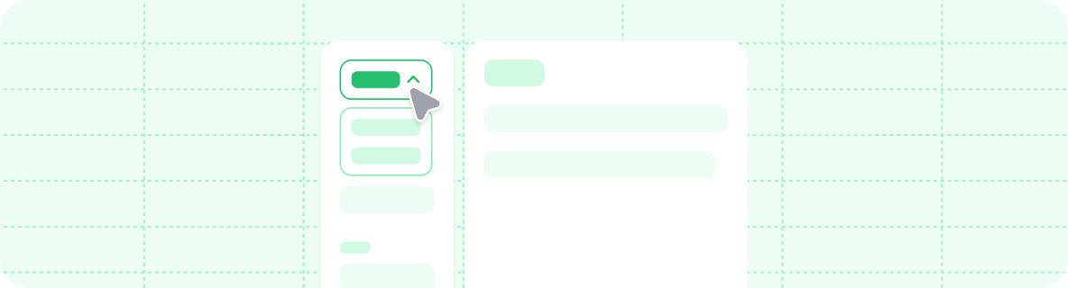
In the navigation object, dropdowns is an array. Each entry is an object that requires a dropdown field and can contain other navigation fields, such as groups, pages, icons, or links to external pages.
{
  "navigation": {
    "dropdowns": [
      {
        "dropdown": "Documentation",
        "icon": "book-open",
        "pages": [
          "quickstart",
          "development",
          "navigation"
        ]
      },
      {
        "dropdown": "API reference",
        "icon": "square-terminal",
        "pages": [
          "api-reference/get",
          "api-reference/post",
          "api-reference/delete"
        ]
      },
      {
        "dropdown": "Blog",
        "href": "https://external-link.com/blog"
      }
    ]
  }
}
OpenAPI
Section titled “OpenAPI”Integrate OpenAPI specifications directly into your navigation structure to automatically generate API documentation. Create dedicated API sections or place endpoint pages within other navigation components.
Set a default OpenAPI specification at any level of your navigation hierarchy. Child elements inherit the specification unless they define their own.
For more information about referencing OpenAPI endpoints in your docs, see the OpenAPI setup.
{
  "navigation": {
    "groups": [
      {
        "group": "API reference",
        "openapi": "/path/to/openapi-v1.json",
        "pages": [
          "overview",
          "authentication",
          "GET /users",
          "POST /users",
          {
            "group": "Products",
            "openapi": "/path/to/openapi-v2.json",
            "pages": [
              "GET /products",
              "POST /products"
            ]
          }
        ]
      }
    ]
  }
}
SDK references
Section titled “SDK references”Generate SDK reference pages from the build artifacts of your documentation tools. Add an sdk property to a tab with the artifact format (typedoc, docfx, javadoc, sphinx, or phpdoc) and a source path or HTTPS URL. You can also add an optional directory for the URL prefix of generated pages.
Mintlify parses the artifact and generates navigation groups and pages for every class, interface, module, and function in the library.
For more information about generating artifacts and configuring sources, see the SDK reference setup.
{
  "navigation": {
    "tabs": [
      {
        "tab": "TypeScript SDK",
        "sdk": {
          "format": "typedoc",
          "source": "sdk-artifacts/typedoc.json",
          "directory": "sdk/typescript"
        }
      }
    ]
  }
}
Versions
Section titled “Versions”Partition your navigation into different versions. Versions are selectable from a dropdown menu.
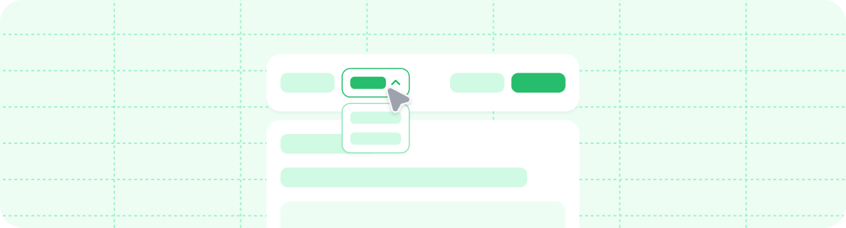
In the navigation object, versions is an array. Each entry is an object that requires a version field and can contain any other navigation fields.
{
  "navigation": {
    "versions": [
      {
        "version": "1.0.0",
        "groups": [
          {
            "group": "Getting started",
            "pages": ["v1/overview", "v1/quickstart", "v1/development"]
          }
        ]
      },
      {
        "version": "2.0.0",
        "groups": [
          {
            "group": "Getting started",
            "pages": ["v2/overview", "v2/quickstart", "v2/development"]
          }
        ]
      }
    ]
  }
}
Default version
Section titled “Default version”Mintlify uses the first version in the versions array as the default. Use the default field to specify a different version as the default.
{
  "navigation": {
    "versions": [
      {
        "version": "1.0.0",
        "groups": [
          {
            "group": "Getting started",
            "pages": ["v1/overview", "v1/quickstart"]
          }
        ]
      },
      {
        "version": "2.0.0",
        "default": true,
        "groups": [
          {
            "group": "Getting started",
            "pages": ["v2/overview", "v2/quickstart"]
          }
        ]
      }
    ]
  }
}
Version tags
Section titled “Version tags”Add a badge label to version entries in the version selector dropdown using the optional tag field. Use tags to highlight specific versions such as "Latest," "Recommended," or "Beta."
{
  "navigation": {
    "versions": [
      {
        "version": "2026_03",
        "tag": "Latest",
        "groups": [
          {
            "group": "Getting started",
            "pages": ["getting-started", "quickstart"]
          }
        ]
      },
      {
        "version": "2025_12",
        "tag": "Recommended",
        "groups": [
          {
            "group": "Getting started",
            "pages": ["2025_12/getting-started", "2025_12/quickstart"]
          }
        ]
      },
      {
        "version": "2025_09",
        "tag": "Deprecated",
        "groups": [
          {
            "group": "Getting started",
            "pages": ["2025_09/getting-started", "2025_09/quickstart"]
          }
        ]
      }
    ]
  }
}
Languages
Section titled “Languages”Partition your navigation into different languages. Languages are selectable from a dropdown menu.
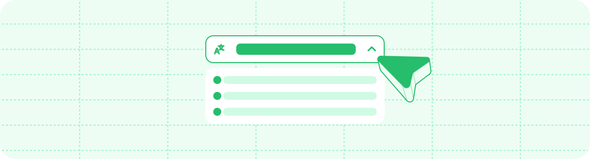
In the navigation object, languages is an array. Each entry is an object that requires a language field and can contain any other navigation fields, including language-specific banner, footer, and navbar configurations.
Mintlify supports the following languages for localization:
| Language | Code |
|---|---|
| Arabic | ar |
| Catalan | ca |
| Chinese | cn |
| Chinese (Traditional) | zh-Hant |
| Czech | cs |
| Danish | da |
| Dutch | nl |
| English | en |
| Finnish | fi |
| French | fr |
| German | de |
| Hebrew | he |
| Hindi | hi |
| Hungarian | hu |
| Indonesian | id |
| Italian | it |
| Japanese | jp |
| Korean | ko |
| Latvian | lv |
| Norwegian | no |
| Polish | pl |
| Portuguese (Brazil) | pt-BR |
| Romanian | ro |
| Russian | ru |
| Spanish | es |
| Swedish | sv |
| Turkish | tr |
| Ukrainian | uk |
| Uzbek | uz |
| Vietnamese | vi |
{
  "navigation": {
    "languages": [
      {
        "language": "en",
        "banner": {
          "content": "🚀 Version 2.0 is now live! See our [changelog](/en/changelog) for details.",
          "dismissible": true
        },
        "footer": {
          "socials": {
            "x": "https://x.com/mintlify"
          },
          "links": [
            {
              "header": "Resources",
              "items": [
                { "label": "Documentation", "href": "/en/docs" },
                { "label": "Blog", "href": "https://mintlify.com/blog" }
              ]
            }
          ]
        },
        "navbar": {
          "links": [
            { "label": "Docs", "href": "/en/docs" }
          ],
          "primary": {
            "type": "button",
            "label": "Get Started",
            "href": "/en/quickstart"
          }
        },
        "groups": [
          {
            "group": "Getting started",
            "pages": ["en/overview", "en/quickstart", "en/development"]
          }
        ]
      },
      {
        "language": "es",
        "banner": {
          "content": "🚀 ¡La versión 2.0 ya está disponible! Consulta nuestro [registro de cambios](/es/changelog).",
          "dismissible": true
        },
        "footer": {
          "socials": {
            "x": "https://x.com/mintlify"
          },
          "links": [
            {
              "header": "Recursos",
              "items": [
                { "label": "Documentación", "href": "/es/docs" },
                { "label": "Blog", "href": "https://mintlify.com/blog" }
              ]
            }
          ]
        },
        "navbar": {
          "links": [
            { "label": "Documentación", "href": "/es/docs" }
          ],
          "primary": {
            "type": "button",
            "label": "Comenzar",
            "href": "/es/quickstart"
          }
        },
        "groups": [
          {
            "group": "Getting started",
            "pages": ["es/overview", "es/quickstart", "es/development"]
          }
        ]
      }
    ]
  }
}
For automated translations, set up an automation to run the agent on a schedule or in response to repository pushes.
Route visitors to their preferred language
Section titled “Route visitors to their preferred language”If you publish in multiple languages, you can redirect visitors from the root of your site to the language that matches their browser's Accept-Language header.
- Navigate to the General page in your dashboard.
- In the Language routing section, enable Auto-route by language.
If a visitor selects a language with the language switcher, Mintlify remembers their choice and stops auto-routing them. If no published language matches the visitor's browser preferences, Mintlify serves your default language.
Nesting
Section titled “Nesting”You can nest navigation elements within each other to create complex hierarchies. You must have one root-level parent navigation element such as tabs, groups, or a dropdown. You can nest other types of navigation elements within your primary navigation pattern.
Each navigation element can contain one type of child element at each level of your navigation hierarchy. For example, a tab can contain anchors that contain groups, but a tab cannot contain both anchors and groups at the same level.
Mixing incompatible child types at the same level fails schema validation. Run mint validate locally before publishing to catch these errors.
{
  "navigation": {
    "tabs": [
      {
        "tab": "Documentation",
        "anchors": [
          {
            "anchor": "Guides",
            "icon": "book-open",
            "pages": ["quickstart", "tutorial"]
          },
          {
            "anchor": "API Reference",
            "icon": "code",
            "pages": ["api/overview", "api/endpoints"]
          }
        ]
      },
      {
        "tab": "Resources",
        "groups": [
          {
            "group": "Help",
            "pages": ["support", "faq"]
          }
        ]
      }
    ]
  }
}{
"navigation": {
"anchors": [
{
"anchor": "Documentation",
"icon": "book-open",
"tabs": [
{
"tab": "Guides",
"pages": ["quickstart", "tutorial"]
},
{
"tab": "API",
"pages": ["api/overview", "api/endpoints"]
}
]
},
{
"anchor": "Community",
"icon": "users",
"href": "https://community.example.com"
}
]
}
}{
"navigation": {
"products": [
{
"product": "Platform",
"icon": "server",
"tabs": [
{
"tab": "Documentation",
"groups": [
{
"group": "Getting started",
"pages": ["platform/quickstart"]
}
]
},
{
"tab": "API Reference",
"pages": ["platform/api"]
}
]
},
{
"product": "Mobile SDK",
"icon": "mobile",
"pages": ["mobile/overview"]
}
]
}
}{
"navigation": {
"products": [
{
"product": "Platform",
"icon": "cloud",
"tabs": [
{
"tab": "Documentation",
"menu": [
{
"item": "Getting Started",
"icon": "rocket",
"groups": [
{
"group": "Setup",
"pages": ["platform/install", "platform/config"]
},
{
"group": "Core Concepts",
"pages": ["platform/concepts/auth", "platform/concepts/data"]
}
]
},
{
"item": "Guides",
"icon": "book",
"pages": ["platform/guides/deployment", "platform/guides/scaling"]
}
]
},
{
"tab": "API Reference",
"groups": [
{
"group": "REST API",
"pages": ["platform/api/users", "platform/api/projects"]
},
{
"group": "GraphQL",
"pages": ["platform/api/graphql/queries", "platform/api/graphql/mutations"]
}
]
}
]
},
{
"product": "Analytics",
"icon": "chart-bar",
"tabs": [
{
"tab": "Documentation",
"groups": [
{
"group": "Getting Started",
"pages": ["analytics/quickstart", "analytics/setup"]
}
]
},
{
"tab": "API",
"pages": ["analytics/api/events", "analytics/api/reports"]
}
]
}
]
}
}{
"navigation": {
"versions": [
{
"version": "v2.0",
"tabs": [
{
"tab": "Documentation",
"groups": [
{
"group": "Getting Started",
"pages": ["v2/quickstart", "v2/migration-from-v1"]
},
{
"group": "Features",
"pages": ["v2/features/auth", "v2/features/api"]
}
]
},
{
"tab": "API Reference",
"pages": ["v2/api/overview", "v2/api/endpoints"]
}
]
},
{
"version": "v1.0",
"tabs": [
{
"tab": "Documentation",
"groups": [
{
"group": "Getting Started",
"pages": ["v1/quickstart"]
}
]
},
{
"tab": "API Reference",
"pages": ["v1/api/overview"]
}
]
}
]
}
}Breadcrumbs
Section titled “Breadcrumbs”Breadcrumbs display the full navigation path at the top of pages. Some themes have breadcrumbs enabled by default and others do not. You can control whether breadcrumbs display on your site using the styling property in your docs.json.
A group in the breadcrumb path links to its root page. Groups without a root page display as plain text.
"styling": {
  "eyebrows": "breadcrumbs"
}"styling": {
"eyebrows": "section"
}Interaction configuration
Section titled “Interaction configuration”Control how users interact with navigation elements using the interaction property in your docs.json.
Enable auto-navigation for groups
Section titled “Enable auto-navigation for groups”When a user expands a navigation group, some themes automatically navigate to the first page in the group. You can override a theme's default behavior using the drilldown option.
- Set to
trueto force automatic navigation to the first page when a user selects a navigation group. - Set to
falseto prevent navigation and only expand or collapse the group when a user selects a navigation group. - Leave unset to use the theme's default behavior.
"interaction": {
  "drilldown": true  // Force navigation to first page when a user expands a dropdown
}"interaction": {
"drilldown": false // Never navigate, only expand or collapse the group
}